
Web Design Features
My approach to web design focuses on designing for the medium, which means embracing the fluidity of the web and its unlimited viewport sizes. It also means leveraging time-honored design principles, typographic best practices, and smart UI/UX decisions to deliver a seamless and enjoyable user experience.
Solid Principles
All great design has its foundation in principles like rhythm and proportion, harmony and counterpoint, and the human touch of how to employ them.

Adaptable Design
No two screens are alike, which is why pixel-perfect, static representations are a fool’s errand. Responsiveness and adaptability are the web’s language.

Flexible Typography
95% of the web is text, so harnessing the power of fluid type scales and organized hierarchies helps the design serve the message.

Beautiful UI
Elements on a page are there not simply to look good but to facilitate a purpose. Form and function are two parts of one whole.

Friendly UX
Good design respects the intentions and needs of the end user, and reflects kindness, inclusivity, and transparency in its design decisions.

Unique Look & Feel
Whatever you want to call it—the gestalt, the je ne sais quoi—every design has its own unique “something” that makes it special, and it's my job to bring it out.

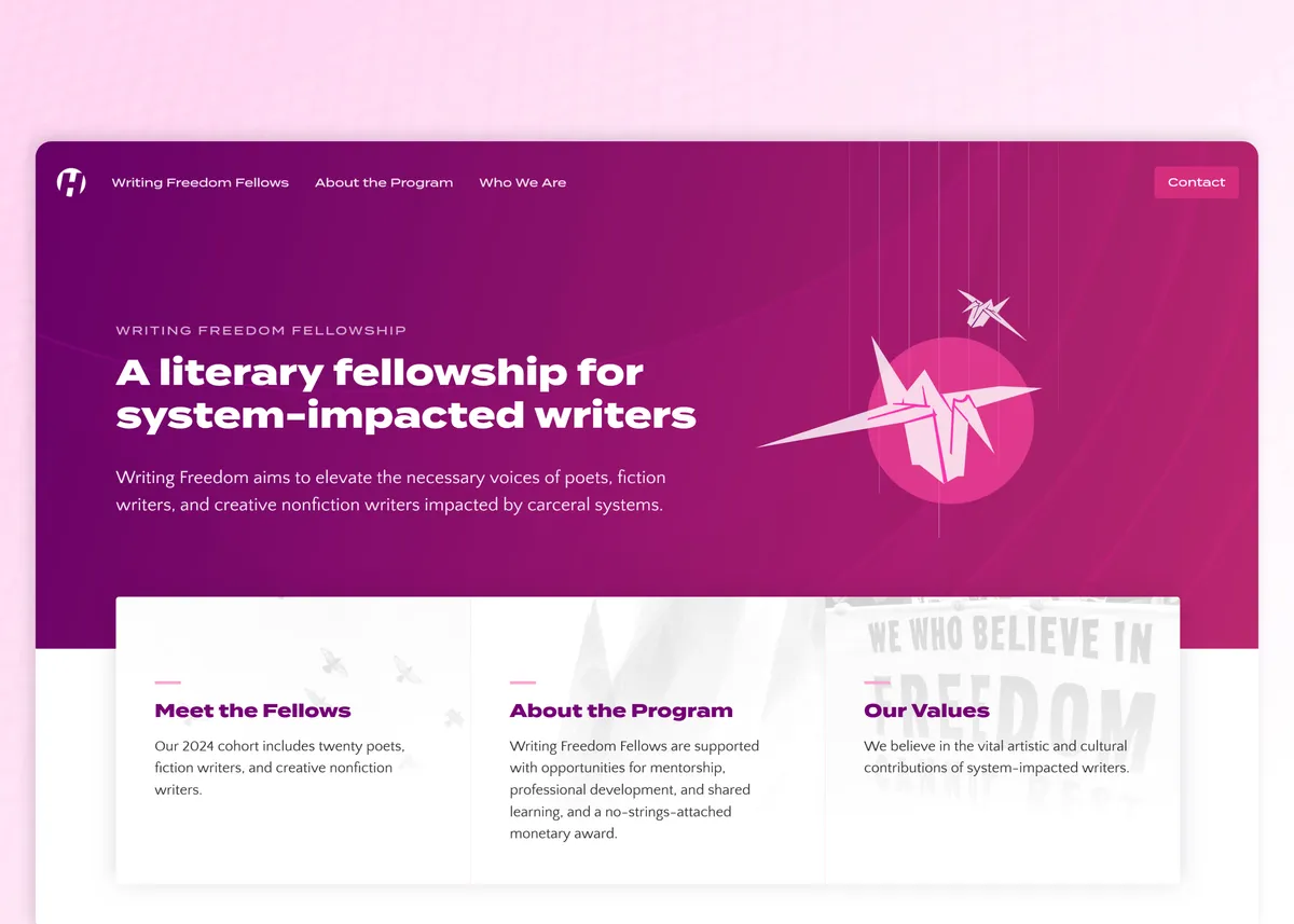
Writing Freedom Fellowship
Elevating the voices of system-impacted creative writers.
- Responsive Web Design
- GSAP Animations
- Static/Jamstack Development
- Frontend Development
- Sanity CMS Integration
When we work together, the design process will be highly dialectical and iterative. That is, there is usually a lot of back and forth between us, a lot of refining, before we settle on a design that works for everyone. It’s rare that a solution is discovered right off the bat with no further adjustments (rare, but not impossible!).
Of course, this process goes both ways—I expect a pretty high level of engagement from clients when we’re just starting out. Having consistent interaction and feedback during the content planning and design phases is what ensures a final product that meets expectations and achieves goals.
In most circumstances, I’ll prefer to use live development sites to show dynamic design work in the context of the browser. Static visuals can be useful for high-level, broad-brush stroke ideas, but nothing compares to seeing and interacting with the design in its live setting.
Design for the Web
The web is an inherently fluid medium that calls for designs that effortlessly adapt to changing viewport sizes and contexts.


Consider All Users
A site that works only for a privileged few goes against the ethos of accessibility in the idea of the world wide web.


Build Intelligently
Because web technology changes at lightning speed, it’s important to bet on the fundamental parts that won’t change—HTML, CSS, and JS.
